Figma typography styles
Create clean, readable interfaces with a typography system built for clarity and consistency. Our carefully structured text styles support hierarchy, accessibility, and scalability so you can maintain visual harmony across any project.
Figma foundations
Essential styles, assets, and guidance to set a solid foundation for any design system in Figma.


Figma base components
Essential base components that provide a solid foundation for modern interface design.


Figma marketing components
Device mockups and useful utility pages — all of the shared assets you need for modern product design and websites.


Examples
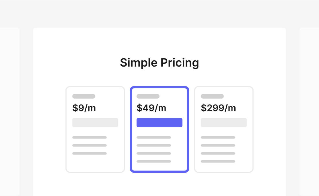
See Zoma UI in action
Explore clean, functional designs built with Zoma UI's components and styles, ready for real-world use.


What are you waiting for? Zoma UI has everything you need to bring your next project to life.